Direct answer
Match blinds closely to the walls when you want a calm, spacious and continuous look. Use contrast when the window needs definition, the blind has a beautiful natural texture, or the room already contains a repeated accent colour. The best choice usually repeats an existing undertone rather than introducing an unrelated colour.
Key takeaways
- Matching colours visually simplify the room and can make it feel larger.
- Contrast can frame the window and highlight material or architecture.
- Undertone, daylight and the colour of the window frame matter.
- Always test a real sample at the window during day and night.
The design decision in one sentence
Matching and contrasting can both look professional. The correct approach depends on whether you want the window treatment to recede into the background or become a visible design element.
Match the walls
For visual calm, small rooms, many windows, minimalist interiors and low-contrast architecture.
Create contrast
For window definition, natural texture, dramatic rooms, feature colours and strong architectural framing.
When matching the wall works best
A blind close to the wall colour creates continuity. It prevents each window from breaking the visual plane, which is useful in compact bedrooms, apartments and rooms with several openings.
The colours do not need to be identical. A warm cream blind can work with an off-white wall, and a sand-toned blind can sit comfortably against beige. Matching the undertone is more important than matching a paint code exactly.
When contrast is the better choice
Contrast gives the window a frame. A dark blind on a light wall can add structure; a natural bamboo blind can warm a cool neutral room; and a coloured Roman blind can repeat artwork, upholstery or a rug.
Strong contrast works best when it is repeated elsewhere. A black blind may relate to black window frames and lighting. A terracotta border may echo cushions or pottery. Repetition makes contrast look intentional.
How material changes the colour decision
Bamboo and natural woven blinds
Natural grain already creates gentle contrast, even when the colour is close to the wall. This makes bamboo useful for adding warmth without a loud pattern.
Roller blinds
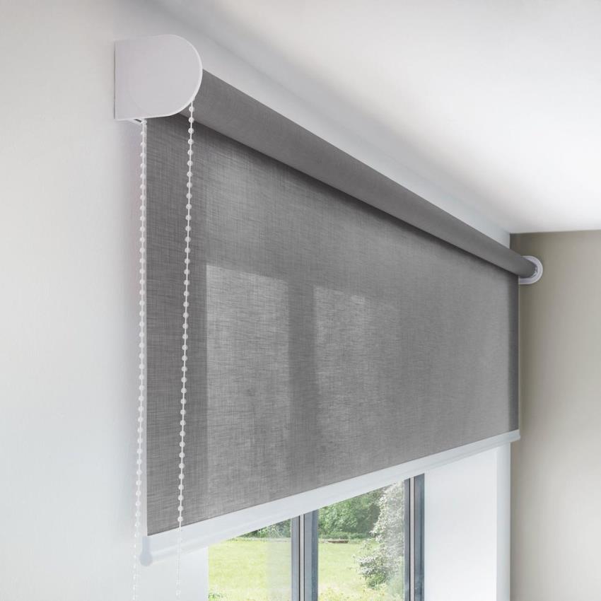
Large flat surfaces show colour clearly. A close match appears minimal; a bold contrast becomes a strong rectangle when closed.
Roman blinds
Folds create shadow and make even a neutral fabric look richer. Pattern and trim can connect the blind to other textiles.
Venetian and vertical blinds
Slats create repeated lines. Matching reduces visual activity, while contrast emphasises their geometry.
Five checks before selecting the colour
- Wall undertone: warm, cool, green, pink, yellow or grey?
- Window frame: white, wood, black, aluminium or coloured?
- Natural light: direct warm sun or cooler indirect light?
- Floor and furniture: which finishes already dominate?
- Blind position: inside a recess or covering the wall outside it?
A colour sample can look different when held flat under showroom lighting. Test it vertically at the actual window during the morning, afternoon and after the room lights are switched on.
Reliable colour strategies
| Room goal | Blind strategy |
|---|---|
| Make a small room feel less busy | Choose a close wall match with a simple mechanism. |
| Add warmth to white or grey walls | Use natural bamboo, sand, tan or warm timber tones. |
| Highlight black window frames | Repeat black or charcoal carefully in the blind or hardware. |
| Create a soft luxury look | Use a tonal Roman blind with textured fabric. |
| Make the window a feature | Use contrast that repeats an existing accent colour. |
| Prepare a rental for broad appeal | Use durable warm neutrals rather than a highly personal colour. |
The Chick Blinds can compare material and colour samples for bamboo, PVC, roller, Roman, zebra and vertical blind projects.
A simple three-colour formula
Look at three fixed elements before choosing the blind: wall colour, window frame and floor or major furniture. The blind should relate clearly to at least one of them. It can match the wall, repeat the frame or introduce the warm tone of wood and flooring.
For example, an off-white wall, black frame and oak floor can support three different successful choices. An off-white roller will disappear visually. A charcoal blind will emphasise the architecture. A natural bamboo blind will connect the window to the floor and add warmth. None is automatically correct; the room goal decides.
When using contrast, repeat it at least once. A dark blind feels intentional when black appears in lighting, handles or artwork. A coloured Roman shade works better when the colour reappears in cushions or a rug.
Room-by-room colour decisions
| Room | Safer matching choice | Useful contrast choice |
|---|---|---|
| Small bedroom | Blind close to wall colour for calm continuity | Soft natural texture rather than a very dark block |
| Large living room | Tonal Roman or roller | Natural bamboo, patterned Roman or dark architectural blind |
| Kitchen | Neutral washable blind | Frame-matching black or wood tone |
| Home office | Low-glare neutral | Structured Venetian slats matching furniture |
| Balcony | Natural or exterior-compatible neutral | Darker edge binding that repeats frames or railings |
Common colour mistakes
- Choosing bright white beside a warm cream wall without checking undertones.
- Selecting a dramatic dark roller for a small window without considering the large block of colour when closed.
- Matching a digital photograph instead of viewing a physical sample.
- Ignoring the exterior appearance of street-facing windows.
- Using a fashionable accent that appears nowhere else in the room.
- Forgetting that daylight and warm artificial light change colour.
Hold the sample vertically at the window and view it morning, afternoon and night. The Chick Blinds can compare bamboo, PVC, roller, Roman, zebra and vertical materials in relation to walls, frames and practical light-control needs.
How to test a blind sample in real light
Place the sample vertically in the exact part of the window where the blind will hang. A sample lying flat on a table receives light differently and can appear lighter or warmer. View it from the entrance to the room, from the main seating position and from close to the window.
Check it in morning daylight, strong afternoon light and after switching on the normal lamps. Warm bulbs can turn a cool grey fabric slightly beige, while direct sun can expose green or pink undertones that were invisible in the showroom. Place the sample beside the wall, frame, floor and largest furniture item.
For a roller or Roman blind, imagine the complete area when closed. A bold colour on a small sample becomes a large solid surface at night. For a slatted or woven blind, texture breaks up the colour and usually makes contrast feel softer.
Take phone photographs only as a record; do not make the final choice from the screen because cameras and displays change colour. Leave the sample in place for a day when possible. A colour that remains comfortable under several conditions is a safer long-term decision.
Frequently asked questions
Should blinds be lighter or darker than walls?
Either works. Lighter or matching blinds feel calm and integrated; darker blinds define the window and create contrast. Undertone and room lighting are more important than a universal rule.
Do white blinds go with every wall colour?
White is versatile, but bright white can clash with warm cream walls. Choose a white or neutral with a compatible undertone.
Should all blinds in a house be the same colour?
Street-facing blinds can share a consistent exterior appearance while interior fabrics vary by room. Consistency is useful, but complete uniformity is not required.
What colour blinds make a room look bigger?
Blinds close to the wall colour reduce visual breaks and can make the room feel more continuous. A simple inside mount also keeps the window area uncluttered.